Two-tone kitchen cabinets can add contrast, depth, and visual interest without requiring an entirely different cabinet layout. Instead of using one color throughout the kitchen, homeowners can combine two complementary shades to create defined areas and a more layered appearance.
The concept can be as simple as pairing white upper cabinets with dark lower cabinets or as distinctive as using a contrasting color on the kitchen island. The right combination depends on the size of the kitchen, lighting, countertops, backsplash, flooring, and overall design style.
Two tone painted kitchen cabinets can work in modern, transitional, traditional, and contemporary kitchens. However, choosing two colors does not automatically create a balanced design. The shades, placement, undertones, and finish should work together.
This guide covers practical two-tone cabinet ideas, how to choose colors, where to place each shade, and common mistakes to avoid when planning a cabinet painting project.
What Are Two-Tone Painted Kitchen Cabinets?
Two-tone painted kitchen cabinets use two distinct colors or finishes within the same kitchen cabinet design.
The colors can be distributed in several ways:
- Upper cabinets in one color and lower cabinets in another
- Kitchen island in a contrasting color
- Base cabinets in one shade with tall cabinets in another
- Perimeter cabinets in one color with a separate accent section
- Painted cabinets paired with natural wood elements
The goal is not simply to use two unrelated colors. The colors should have some relationship through their undertones, intensity, or connection to other elements in the kitchen.
For example, white and navy provide noticeable contrast while remaining visually compatible. Cream and muted green create a softer combination. Gray paired with a warm wood tone can introduce contrast through both color and texture.
Why Choose a Two-Tone Cabinet Design?
There are several reasons homeowners consider a two-color cabinet approach.
Adds Visual Contrast
Using two cabinet colors can prevent a large kitchen from appearing visually flat. A darker lower cabinet paired with a lighter upper cabinet can create a clear distinction between different parts of the room.
Creates Depth
Color placement can influence how large or compact a kitchen appears. Lighter upper cabinets can help maintain an open appearance, while darker lower cabinets can visually anchor the room.
Defines the Kitchen Island
An island is often a natural location for a second cabinet color. A different island shade can create a focal point without requiring every cabinet to have a contrasting color.
Provides More Design Flexibility
Two colors provide more options than a single-color cabinet scheme. Homeowners can incorporate a favorite accent color while keeping the majority of the cabinetry neutral.
Popular Two-Tone Kitchen Cabinet Ideas
There are many ways to approach two-tone cabinets. The best combination depends on the surrounding finishes and the desired level of contrast.
White Upper Cabinets With Dark Lower Cabinets
This is one of the most recognizable two-tone approaches. White or another light neutral on the upper cabinets can keep the upper portion of the kitchen visually open.
A darker lower color, such as charcoal, navy, or deep green, creates contrast and gives the lower cabinets more visual weight.
This combination can work particularly well in kitchens where homeowners want contrast without making the entire room dark.
Light gray and navy provide a cooler color combination with clear contrast.
Light gray can be used on upper or perimeter cabinets, while navy can be used on lower cabinets or an island. The combination can work well with white countertops, stainless steel appliances, and simple hardware.
Warm White With Natural Wood
A painted warm white paired with natural wood introduces both color and texture.
The wood element does not necessarily need to be painted. It can appear through an island, open shelving, or selected cabinetry.
This approach can help prevent an otherwise neutral kitchen from looking too uniform.
Green With Cream
Muted green and cream can create a softer two-tone appearance. Sage, olive, or other subdued green shades can work with warm neutral cabinetry.
This combination can be especially useful when the kitchen includes natural materials such as wood flooring, stone countertops, or woven textures.
Black and White Cabinets
Black and white create a high-contrast appearance. Because the difference between the two shades is significant, the placement of each color becomes important.
White can be used for upper cabinets while black is reserved for lower cabinets or an island. This allows the darker color to act as an accent rather than dominating the entire kitchen.
Neutral Cabinets With a Bold Island
Another approach is to keep the main cabinets relatively neutral and use a stronger color on the island.
For example, white or light gray perimeter cabinets could be combined with a dark blue, green, or charcoal island.
This approach can be useful when homeowners want a noticeable accent without committing to two colors across all cabinetry.
How to Choose Colors for Two-Tone Cabinets
Selecting colors should involve more than choosing two shades that look attractive individually. They need to work together within the actual kitchen.
Consider Kitchen Size
In smaller kitchens, very dark colors can make the cabinetry feel visually heavier if used extensively.
A lighter upper cabinet combined with a darker lower cabinet can provide contrast while maintaining an open appearance.
Larger kitchens generally provide more flexibility because there is more visual space for stronger color combinations.
Look at Natural and Artificial Lighting
Lighting can significantly change how cabinet colors appear.
A color that looks neutral in a paint store may appear warmer, cooler, darker, or lighter in a particular kitchen.
Check samples under:
- Morning daylight
- Afternoon daylight
- Evening lighting
- Warm artificial bulbs
- Cool artificial bulbs
This can help identify unwanted undertones before the cabinets are painted.
Coordinate With Countertops
Countertops occupy a large visual area and should be considered when selecting cabinet colors.
If the countertop has strong patterns or multiple colors, simpler cabinet colors may create a more balanced appearance.
If the countertop is relatively simple, cabinets can provide more of the room’s visual contrast.
Consider Flooring and Backsplash
Cabinets should also relate to the flooring and backsplash.
For example, warm beige flooring may work more naturally with warm whites, creams, and muted earthy colors than with extremely cool cabinet shades.
This does not mean every element needs to match. Instead, the undertones should work together.
Choose Colors With Different Visual Weights
Two colors do not have to be equally strong.
A common approach is to use a light neutral as the primary color and a darker or more saturated shade as the secondary color.
This creates a hierarchy that makes the design easier to balance.
Where Should the Second Cabinet Color Go?
There is no single rule for placing the second color. However, certain arrangements are easier to balance than others.
Upper and Lower Cabinets
Using different colors for upper and lower cabinets creates a horizontal division.
A lighter upper color and darker lower color is a common arrangement because it can visually anchor the lower portion of the kitchen.
Kitchen Island
The island is one of the easiest places to introduce a second color.
If the perimeter cabinets are white, for example, a navy or green island can become a visual focal point.
Tall Cabinets
Pantry cabinets and other tall storage units can also be used as an accent section. However, this approach should be considered carefully because tall cabinets occupy a substantial vertical area.
Accent Sections
A smaller section of cabinetry can use a second color without changing the appearance of the entire kitchen.
This can work when homeowners want some contrast but prefer a mostly uniform cabinet design.
Two-Tone Cabinet Color Combinations
The following combinations can help illustrate how different color relationships affect the overall appearance.
| Color Combination | Visual Effect | Suitable Design Direction |
|---|---|---|
| White + Navy | Crisp and defined | Modern and transitional |
| White + Gray | Subtle contrast | Contemporary and neutral |
| Cream + Green | Warm and natural | Transitional and traditional |
| Black + White | High contrast | Contemporary |
| Gray + Wood | Color and texture | Modern and transitional |
| Beige + Charcoal | Warm and grounded | Modern and neutral |
These are starting points rather than strict rules. Actual results depend on the specific shades, lighting, surrounding materials, and cabinet layout.
How to Make Two-Tone Cabinets Look Cohesive
Using two colors successfully requires some repetition and coordination.
Repeat One Color Elsewhere
If the island is navy, for example, small elements such as hardware, seating, accessories, or nearby decor can help connect the color to the rest of the room.
The repetition does not need to be exact, but the relationship can help the kitchen feel intentional.
Coordinate Hardware
Hardware should work with both cabinet colors.
Metal finishes such as brushed nickel, brass, bronze, or black can produce different effects depending on the selected cabinet colors.
Consider the overall kitchen rather than choosing hardware based only on one cabinet shade.
Keep the Finish Consistent
Using different colors does not necessarily mean using different sheens.
A consistent sheen across both cabinet colors can help create a unified appearance.
Balance Warm and Cool Tones
Pay attention to undertones.
A warm white paired with a strongly blue-gray color can sometimes create an unexpected contrast. Testing physical samples can help identify whether the combination works under the kitchen’s lighting.
Painting Considerations for Two-Tone Cabinets
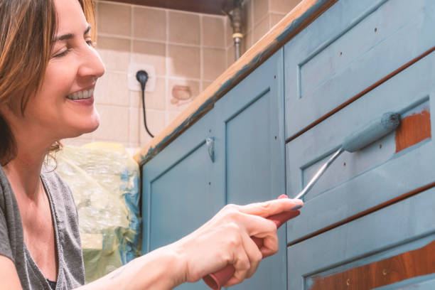
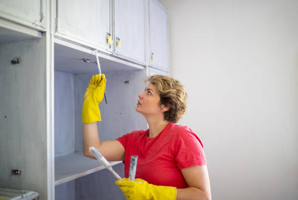
Creating two-tone painted cabinets requires the same basic surface preparation as a single-color cabinet project, with additional attention to color separation.
Prepare the Surfaces
Cabinets should be cleaned to remove grease, dust, and other contaminants. Surface imperfections should be addressed before painting.
Use Appropriate Primer
Primer may be required depending on the cabinet material, existing finish, and selected paint.
Using the correct primer can help improve adhesion and create a consistent base for the topcoat.
Use Compatible Paint Products
Both cabinet colors should use products suitable for the cabinet material and expected level of use.
Using the same product line for both colors can also make it easier to maintain consistency in sheen and finish.
Maintain Clean Color Transitions
When two colors meet, careful preparation and application are important.
Doors, drawer fronts, and cabinet frames should be planned so that the color boundaries appear intentional.
Allow Adequate Drying and Curing
Paint may dry to the touch before it has fully cured. Cabinet doors and drawers should be handled according to the manufacturer’s recommended curing times.
Common Mistakes to Avoid
Using Too Many Colors
A two-tone design generally works best when two clearly defined colors establish the main cabinet scheme. Adding multiple unrelated accent colors can make the kitchen feel visually busy.
Ignoring Undertones
Two colors can look compatible on a screen but appear very different in the actual kitchen.
Always evaluate samples in the room where they will be used.
Making Both Colors Too Strong
Two highly saturated or extremely dark colors can compete for attention.
Using one primary neutral and one stronger accent can create a more controlled visual hierarchy.
Ignoring the Countertop
Cabinet colors should not be selected independently from countertops, backsplash, and flooring.
These surfaces should be considered together before the final color decision.
Using Inconsistent Finishes
Different sheens can make two colors appear even more different. Unless there is a specific design reason, keeping the sheen consistent can create a more cohesive result.
Are Two-Tone Cabinets Suitable for Modern Kitchens?
Yes. Two tone painted kitchen cabinets can work particularly well in modern kitchens because contemporary designs often use contrast, simple color palettes, and defined focal points.
However, the concept is not limited to modern kitchens. The same approach can be adapted to transitional, traditional, farmhouse, and contemporary spaces.
The key is selecting colors and finishes that relate to the rest of the kitchen.
For homeowners considering cabinet painting in Wichita, Bolden’s Painting Co can be considered when evaluating the preparation and painting requirements of an existing cabinet surface. The appropriate approach depends on the cabinet material, current finish, and desired result.
Conclusion
Two tone painted kitchen cabinets can provide a practical way to add contrast and visual structure to a kitchen. From white and navy to cream and green, many combinations can work when the colors relate to the kitchen’s lighting, materials, and overall design.
Before choosing two colors, consider where each shade will be used, how the colors interact with countertops and flooring, and whether the existing cabinets are suitable for painting. Testing samples in the actual kitchen can also help prevent unexpected color results.
For homeowners considering cabinet painting services in Wichita, Bolden’s Painting Co can help assess the painting requirements based on the existing cabinet surfaces and desired finish. If you want to discuss your cabinet project or have questions about the painting process, contact us at Bolden’s Painting Co to learn more about the appropriate options for your kitchen.
Frequently Asked Questions
What are the best two-tone cabinet color combinations?
Popular combinations include white and navy, white and gray, cream and green, black and white, and gray with natural wood. The best combination depends on the kitchen’s lighting and surrounding finishes.
Should upper or lower cabinets be darker?
There is no universal rule, but darker lower cabinets are commonly used because they can visually anchor the kitchen while lighter upper cabinets create a more open appearance.
Can the kitchen island be a different color from the cabinets?
Yes. Painting the island a different color is a common way to introduce a second cabinet color without changing every cabinet in the kitchen.
Are two-tone painted kitchen cabinets still popular?
Two-tone cabinet designs remain a flexible approach because they allow homeowners to combine neutral colors with stronger accents while creating visual separation within the kitchen.
How many cabinet colors should a kitchen have?
A two-color cabinet scheme is often easier to balance than a design using several unrelated colors. Additional colors can be introduced through hardware, countertops, backsplash, flooring, and accessories.
Should two-tone cabinets have the same sheen?
Using the same sheen can create a more consistent appearance. Different sheens can be used intentionally, but they should be evaluated carefully because sheen affects how each color reflects light.
Can I use dark colors in a small kitchen?
Yes, but placement matters. Using a dark shade on lower cabinets or a smaller island area can introduce contrast without making the entire kitchen appear visually heavy.
What should I consider before painting two-tone cabinets?
Evaluate cabinet condition, material, existing finish, kitchen lighting, countertop, backsplash, flooring, desired colors, and the placement of each shade. Proper preparation is also important for the final finish.