
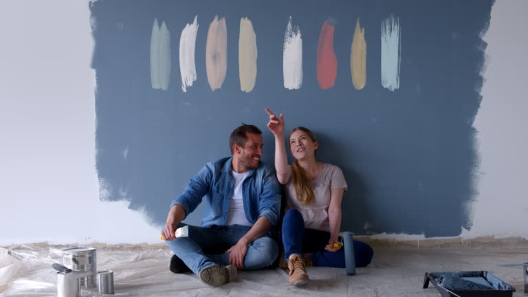
Choosing the right interior paint color can change how a room looks, feels, and functions. However, a color that looks appealing in a small paint sample may appear completely different once it covers an entire wall.
For Houston homeowners, natural light, room orientation, interior lighting, humidity, and existing materials can all influence how paint colors appear. A warm beige may look soft and inviting in one room but noticeably warmer in another. A cool gray may appear crisp under bright daylight but feel cooler under artificial lighting.
The best interior paint colors are therefore not simply the colors that are popular at the moment. They should complement the home’s architecture, flooring, cabinets, furniture, natural light, and overall style.
This guide explores practical color options for Houston homes, including neutral shades, cool tones, warm colors, room-specific choices, and factors to consider before starting an interior painting project.
What Makes a Good Interior Paint Color for a Houston Home?
There is no single best color for every Houston home.
A good choice depends on several factors:
- Amount of natural light
- Direction the room faces
- Size of the room
- Ceiling height
- Flooring color
- Cabinet and countertop colors
- Furniture
- Window treatments
- Existing architectural details
- Type of artificial lighting
- Desired atmosphere
Houston homes can vary significantly in architectural style, from traditional and Craftsman-inspired houses to contemporary and modern properties. Interior paint should support the existing design rather than compete with it.
A useful starting point is to identify the colors already present in the room. Flooring, countertops, wood finishes, upholstery, and fixtures can reveal whether the space has predominantly warm or cool undertones.
Best Neutral Interior Paint Colors for Houston Homes
Neutral colors remain popular because they can work with many different decorating styles.
However, neutral does not have to mean plain. Small differences in undertones can significantly change the appearance of a room.
Soft White
Soft white can make a room feel bright without the stark appearance that some pure whites create.
It works particularly well with:
- Natural wood
- Light flooring
- Neutral furniture
- White trim
- Marble or quartz
- Contemporary interiors
In rooms with abundant sunlight, soft white can create a clean and open appearance.
When to Avoid Very Bright White
Pure white can sometimes appear overly cool or harsh under strong lighting.
If your room receives intense natural light, compare several white samples before selecting the final shade.
Warm Beige
Warm beige can provide a comfortable appearance without making the room feel too dark.
It works well with:
- Brown wood
- Cream furniture
- Warm flooring
- Brass fixtures
- Natural stone
- Traditional interiors
Beige can be particularly useful when a homeowner wants a neutral wall color with more warmth than standard gray.
Greige
Greige combines characteristics of gray and beige.
It has become a popular choice because it can bridge warm and cool elements within the same room.
A greige wall may coordinate with both:
- Warm wood flooring
- Cool gray furniture
- White cabinets
- Natural stone
- Black fixtures
The exact appearance depends heavily on the shade’s undertones and the lighting in the room.
Light Gray
Light gray can create a clean, contemporary appearance.
It pairs well with white trim, dark furniture, natural wood, and modern fixtures.
However, not all grays are the same. Some contain blue undertones, while others contain green, beige, or brown.
Testing a sample in the actual room is important.
Best Cool-Toned Colors for Houston Homes
Cool colors can create a calm and refreshing atmosphere.
They can be especially useful in rooms where homeowners want a relaxed appearance.
Blue
Soft blue can work well in bedrooms, bathrooms, and living areas.
Pale blue can make a room feel light and peaceful, while deeper blue can create a more dramatic appearance.
For larger areas, muted or dusty blue is often easier to coordinate than extremely saturated shades.
Blue-Gray
Blue-gray provides some of the calming qualities of blue while retaining the neutrality of gray.
It can work with:
- White trim
- Light flooring
- Natural wood
- Silver fixtures
- Contemporary furniture
Because blue-gray can appear cooler under certain lighting, compare samples throughout the day.
Sage Green
Sage green is a muted option that can introduce color without overwhelming the room.
It works particularly well with natural materials such as:
- Wood
- Stone
- Rattan
- Linen
- Woven textures
Sage can be suitable for bedrooms, offices, kitchens, and living spaces.
Best Warm-Toned Interior Paint Colors
Warm colors can make rooms feel comfortable and inviting.
They can be particularly useful in homes with warm wood floors, beige tile, traditional furniture, or warm-toned lighting.
Cream
Cream provides warmth while maintaining a relatively light appearance.
It can be a useful alternative to bright white when the room contains warm materials.
Terracotta
Terracotta introduces more color and warmth.
It can work as an accent wall or in rooms where a stronger design statement is appropriate.
Because it is relatively saturated, it should be tested against existing flooring and furniture before use on multiple walls.
Warm Taupe
Warm taupe is another flexible neutral.
It can work with both traditional and contemporary interiors and can complement:
- Brown wood
- Cream
- Beige
- Warm white
- Natural stone
Muted Yellow
Soft, muted yellow can add brightness without becoming as intense as a saturated yellow.
It may work well in kitchens, breakfast areas, or rooms with limited natural light.
The key is choosing a restrained shade rather than an overly bright color.
Best Interior Paint Colors by Room
The function of a room should influence its color.
| Room | Suggested Color Families | Desired Effect |
| Living room | Greige, beige, soft white, muted green | Comfortable and flexible |
| Bedroom | Soft blue, sage, warm white | Calm and restful |
| Kitchen | Cream, warm white, light gray | Clean and adaptable |
| Bathroom | Blue-gray, soft white, sage | Fresh and relaxed |
| Home office | Gray, muted green, blue-gray | Focused and balanced |
| Entryway | Greige, taupe, warm white | Welcoming and practical |
| Dining room | Warm taupe, muted green, deeper blue | Defined and inviting |
These are starting points rather than strict rules. Furniture, flooring, windows, and lighting can change how each shade appears.
How Houston’s Natural Light Affects Paint Color
Natural light can dramatically change the appearance of interior paint.
A room with large south-facing windows may receive strong, warm light for significant portions of the day. North-facing rooms may receive less direct sunlight and can make certain colors appear cooler.
East-facing rooms often receive stronger morning light, while west-facing rooms can receive warmer afternoon and evening light.
This means a paint sample should be viewed at different times of day.
Morning
A color may appear cooler or softer depending on the direction of the windows.
Afternoon
Strong daylight can make certain colors look brighter or more saturated.
Evening
Artificial lighting becomes more influential, potentially changing the apparent undertone.
For this reason, never select interior paint colors solely from an online image or small color card.
How Humidity and Climate Can Influence Interior Paint Choices
Houston’s climate is characterized by significant heat and humidity. Although interior walls are protected from outdoor conditions, indoor moisture can still affect areas such as bathrooms, kitchens, laundry rooms, and poorly ventilated spaces.
Paint color itself does not solve moisture problems.
If you notice:
- Bubbling paint
- Peeling
- Persistent discoloration
- Mildew
- Water stains
- Recurring dampness
the underlying moisture source should be investigated before repainting.
Ventilation and moisture management are important for maintaining interior surfaces.
When selecting a paint product, consider the room’s conditions and follow the manufacturer’s recommendations for the appropriate interior coating.
Light vs. Dark Interior Paint Colors
Both light and dark colors can work effectively in Houston homes.
Benefits of Light Colors
Light interior paint colors can:
- Make small rooms feel more open
- Reflect more available light
- Create a clean appearance
- Coordinate easily with different furniture
- Make ceilings appear visually higher
Soft white, cream, pale gray, beige, and light greige are examples.
Benefits of Dark Colors
Dark colors can:
- Add depth
- Create contrast
- Highlight architectural features
- Make large rooms feel more intimate
- Provide a strong background for artwork
Deep navy, charcoal, forest green, and rich taupe can work as accent colors or throughout rooms where the lighting and design support them.
The size of the room does not automatically determine whether a dark color will work. Natural light, ceiling height, furniture, and the desired mood are equally important.
How to Coordinate Wall Colors With Flooring and Furniture
One of the most common color-selection mistakes is choosing a wall color before considering the rest of the room.
Start with permanent or expensive elements such as:
- Flooring
- Cabinets
- Countertops
- Tile
- Stone
- Built-ins
Then consider furniture and fabrics.
If your flooring has strong warm undertones, a very cool wall color may create an unwanted contrast.
Similarly, cool gray flooring may not coordinate naturally with a strongly yellow-beige wall.
Use Undertones as a Guide
Look closely at the existing materials.
A beige floor may contain:
- Yellow
- Red
- Orange
- Pink
- Gray
A gray floor may contain:
- Blue
- Green
- Violet
- Beige
The wall color does not have to match these undertones exactly, but it should create a deliberate relationship.
Common Interior Paint Color Mistakes to Avoid
Choosing a Color From a Small Sample Alone
Large walls can make a color appear stronger than it did on a small card.
Always test the color in the actual room.
Ignoring Artificial Lighting
LED bulbs, warm bulbs, and cool bulbs can change how paint appears.
Check the color under the lighting you actually use.
Choosing a Trend Without Considering the Home
A popular color may not work with your home’s flooring, cabinets, or architecture.
Trends can provide inspiration, but the existing room should remain the primary consideration.
Using Too Many Similar Colors
Multiple slightly different neutrals can sometimes make rooms feel disconnected.
A consistent color palette can help different spaces transition more naturally.
Forgetting the Ceiling and Trim
Walls are not the only painted surfaces.
Trim, doors, ceilings, and built-ins can influence how the wall color looks.
How to Test Interior Paint Colors Before Repainting
Testing is one of the easiest ways to avoid an unsuitable color.
Step 1: Narrow Down Your Options
Select two to four colors that work with your existing materials.
Step 2: Obtain Physical Samples
Use actual paint samples rather than relying only on digital representations.
Step 3: Test Large Areas
Small samples can be misleading. Test a larger section where possible.
Step 4: Observe Different Lighting
Check the color in morning, afternoon, and evening light.
Step 5: Compare With Your Décor
Look at the sample next to flooring, furniture, cabinets, curtains, and trim.
Step 6: Live With the Color
If possible, observe the sample for several days before making the final decision.
Choosing the Right Paint Finish for Houston Interiors
Color and finish should be considered together.
Flat Finish
Flat paint has very little sheen and can help minimize the appearance of minor surface imperfections.
It may be suitable for low-contact areas where frequent cleaning is not required.
Eggshell Finish
Eggshell provides a subtle sheen and is commonly considered for bedrooms, living rooms, dining rooms, and other general living spaces.
Satin Finish
Satin has more sheen and can be easier to clean, making it a consideration for higher-traffic areas.
Semi-Gloss Finish
Semi-gloss is more reflective and is commonly considered for trim, doors, kitchens, bathrooms, and other surfaces where greater cleanability is desired.
The appropriate finish depends on the room, existing surface, desired appearance, and manufacturer’s recommendations.
Interior Painting Considerations for Houston Homes
Before beginning an interior painting project, evaluate the condition of the existing walls.
Look for:
- Peeling paint
- Cracks
- Holes
- Water stains
- Grease
- Mildew
- Uneven previous repairs
- Loose coatings
Surface preparation may include cleaning, patching, sanding, caulking, and priming where appropriate.
Bolden’s Painting Co provides residential and commercial painting services and lists interior painting among its services. The company’s website identifies Wichita and nearby Kansas communities as its service area.
Because the topic of this article is Houston homes, homeowners should also recognize that a local Houston painting provider may have more direct knowledge of local property conditions and climate considerations. The information about Bolden’s Painting Co is therefore most relevant to its listed Wichita-area service region rather than Houston.
For any painting project, the coating should be selected based on the surface, room conditions, and manufacturer’s specifications rather than location alone.
How to Create a Whole-Home Interior Color Palette
Choosing individual room colors can sometimes result in a disconnected interior.
Instead, consider developing a whole-home palette.
Choose a Main Neutral
Select one versatile neutral for larger areas such as hallways or connected living spaces.
Add Supporting Colors
Use two or three complementary shades for bedrooms, offices, bathrooms, or accent areas.
Repeat Colors
Repeating a color in different rooms through walls, trim, furniture, or accessories can create continuity.
Consider Sightlines
If two rooms are visible from one another, their colors should work together.
For open floor plans, using related shades can help define areas without creating abrupt transitions.
Conclusion
The best interior paint colors for Houston homes depend on more than current color trends. Natural light, room size, flooring, furniture, cabinets, architectural style, artificial lighting, and existing undertones all influence how a color will appear.
Soft whites, warm beige, greige, light gray, sage green, blue-gray, cream, and muted earth tones can all be useful starting points. The right choice depends on the room and the atmosphere you want to create.
Houston’s humidity also makes proper ventilation and surface preparation important, particularly in kitchens, bathrooms, and other moisture-prone areas. If walls show peeling, bubbling, staining, or mildew, investigate the underlying issue before applying new paint.
Bolden’s Painting Co provides residential and commercial painting services in Wichita and surrounding Kansas communities. If your project is located within its service area and you need assistance evaluating your interior walls or planning a repaint, contact us to discuss your painting needs.
FAQ: Interior Paint Colors
What are the best interior paint colors for Houston homes?
There is no single best color for every Houston home. Soft white, warm beige, greige, light gray, sage green, blue-gray, and cream are versatile starting points. The best option depends on natural light, flooring, furniture, and the home’s overall design.
What paint colors make a Houston home feel cooler?
Light and cool-toned colors such as soft blue, blue-gray, pale green, and light gray can create a visually cool and calm atmosphere. Paint color does not actually lower indoor temperature, however.
What are the best neutral interior paint colors?
Soft white, warm beige, greige, light gray, cream, and taupe are versatile neutral options. Choose based on the warm or cool undertones of your existing flooring, furniture, and fixtures.
Should I use warm or cool paint colors?
Either can work. Warm colors can make a room feel comfortable and inviting, while cool colors can create a calm and fresh appearance. Existing materials and natural light should guide the decision.
How does natural light affect interior paint colors?
Natural light can change the perceived brightness and undertone of a color. The same paint can look warmer, cooler, brighter, or darker depending on the time of day and direction of the windows.
What color is best for a small room?
Light colors such as soft white, pale gray, light greige, and cream can make a small room appear more open. However, darker colors can also work when used intentionally with suitable lighting.
What interior paint colors work well with wood floors?
Warm beige, cream, greige, soft white, sage, and certain muted gray shades can complement wood floors. The wood’s undertone should be considered before choosing the wall color.
Should every room in my home be the same color?
No. Different rooms can have different colors. However, using related shades or a consistent color palette can help create a cohesive appearance throughout the home.
How many paint colors should I test before choosing one?
Testing two to four closely related colors is a practical starting point. Apply samples in the actual room and observe them under different lighting conditions before making a final decision.
What paint finish is best for Houston bathrooms?
A washable finish such as satin or another suitable moisture-tolerant interior coating may be considered for bathrooms. Proper ventilation and moisture control are also important.
Does Bolden’s Painting Co serve Houston?
Based on the company’s listed service areas, Bolden’s Painting Co serves Wichita and surrounding Kansas communities rather than Houston. Houston homeowners should verify the service area of any painting contractor before scheduling a project.